Flat, beige, and forgettable – why it’s time to break away from minimalism
For centuries, ornamentation was the heart of design, infusing personality, storytelling, and craftsmanship into everything from architecture to branding. But in recent years, there has been a noticeable shift—a move away from intricate, detail-oriented designs toward stark, stripped-down compositions. While minimalism initially aimed to declutter and simplify, its overuse has led to uninspired, homogenous design, where everything starts to look and feel the same.
This phenomenon is visible in both physical and digital spaces. Take London’s iconic red telephone booths, once a symbol of British charm—many are now being replaced with bland, generic alternatives that lack character. The same is happening in branding, web design, and packaging, where once-distinctive identities have been replaced by minimalist, near-identical aesthetics.


The decline of ornamentation
Ornamentation was once synonymous with sophistication. The Art Nouveau movement celebrated intricate embellishments, elaborate typefaces, and rich decorative elements to convey meaning and beauty. But with the rise of modernism in the 20th century, designers like the Bauhaus pioneers championed functionalism through the mantra “form follows function,” stripping away anything deemed unnecessary.

In the digital age, minimalism has become the dominant design philosophy, with flat design, clean interfaces, and mobile-friendly layouts taking center stage. However, what started as a pursuit of clarity has, in many cases, led to an era of aesthetic sameness.
Minimalism was meant to declutter. Instead, it has erased distinction. Brands no longer just look minimal—they look anonymous.
The price of minimalism: When simplicity becomes sterility
Some of the most striking examples of this shift can be seen in major rebrands:
- Jaguar’s recent rebranding replaced its classic leaping jaguar emblem with a blacked-out, refined aesthetic, aligning with modern luxury but erasing much of its British heritage.

- Airbnb’s 2014 rebrand embraced a clean, contemporary look, but in doing so, stripped away much of the original brand’s character.

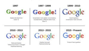
- Google’s logo evolution saw the company trade its distinctive character-heavy serif fonts for a flat, sans-serif design—clean, yes, but also similar to other tech identities.
Minimalism vs. Simplicity
Minimalism and simplicity are often used interchangeably, but they are not the same.
- Simplicity is about clarity and intention—removing the unnecessary while keeping what is meaningful.
- Minimalism, especially in its extreme form, risks stripping away too much, leading to a loss of personality and emotional resonance.
Take Apple, often seen as a minimalist brand. In reality, Apple thrives on simplicity—not minimalism. While its designs are sleek and uncluttered, the brand still uses rich imagery, dramatic lighting, and expressive storytelling. Apple proves that simplicity can still be visually compelling and emotionally engaging.


How colour plays a role in minimalism
Colour plays a crucial role in the minimalist-maximalist spectrum. Minimalist palettes tend to favour monochromes, muted hues, and restrained schemes, creating calm but often uninspiring interfaces. When every brand relies on the same beiges, pale blues, and grayscale tones, differentiation becomes a challenge.
Take Muji, a brand that embodies minimalism not just through product design but also through its muted colour choices—off-whites, kraft browns, and grays. While this evokes simplicity and purity, it also results in a subdued, highly uniform visual identity.


The rise of post-minimalism
Post-minimalism doesn’t reject minimalism outright. Instead, it builds upon its principles while reintroducing elements that were stripped away: texture, personality, irregularity, and storytelling. It embraces:
- Bold typography.
- Rich textures and gradients
- Hand-drawn elements
- Unexpected colour combinations
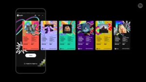
Example: Spotify Wrapped breaks out of minimalism every year with eccentric, maximalist visual identities. This yearly campaign shows how a brand can maintain a clean interface while still experimenting with bold design moments.
Bringing back detail in design can differentiate brands, create richer user experiences. Reintroduce craftsmanship in an age of generic, mass-produced aesthetics. The future of visual identity doesn’t lie in minimalism or maximalism, but in meaning.
Do you want to reimagine your brand? Look us up!

Divya Chandrasekara Reddy
Divya is an architect-turned-designer passionate about exploring diverse creative mediums, with a strong focus on graphic design, user experience, and branding. With over three years of experience in design and branding, she constantly seeks innovative ways to craft compelling brand identities and immersive experiences. Beyond work, she enjoys indulging in photography and architecture, always finding inspiration in the details of the world around her.