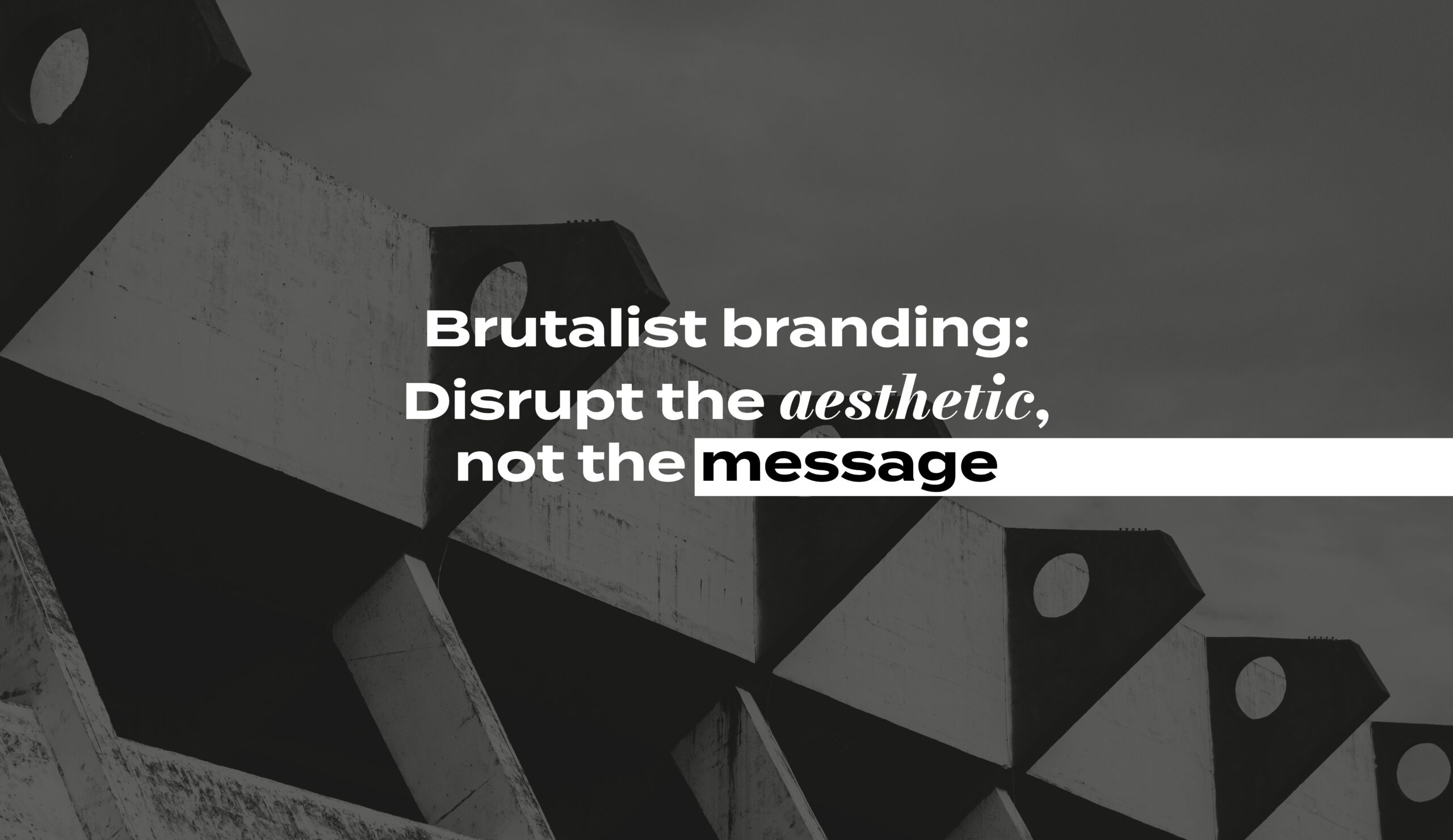
Brutalist branding: Disrupt the aesthetic, not the message
In a world where every brand wants to be “friendly,” “clean,” and “approachable,” brutalist design is the defiant outlier. It’s raw, uncomfortable and intentionally jarring. And that’s precisely its appeal.
Brutalist design throws out the rulebook. It’s a visual language that challenges conventions, resists polish, and embraces discomfort. So why are some brands deliberately choosing harsh typography, clashing colors, and layouts that feel broken?
Because brutalism gets noticed. And in today’s hyper-optimised, overly-sanitised design landscape, attention is currency.
Brutalist Branding – A brief origin story
Brutalism takes its name from the French term béton brut (raw concrete), and originally emerged in post-war Europe as an architectural response to economic hardship. With its bare materials, monolithic shapes, and anti-decorative stance, brutalist architecture rejected luxury in favor of honesty and utility. What began as a response to scarcity became a defiant design philosophy — one that now finds echoes in branding, where visual rawness signals clarity, rebellion, and a rejection of excess.
What is brutalism in branding?
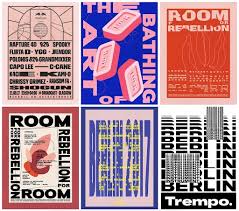
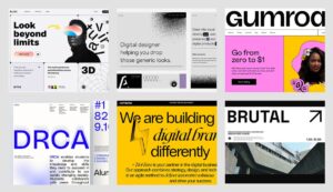
Brutalism in branding draws from the brutalist architecture of the mid-20th century — think exposed concrete, rigid structures, and a complete disregard for ornamental beauty. In graphic and brand design, this translates into:
- Little to no visual decoration
- Use of system fonts or blocky, mono typefaces
- Harsh or intentionally unpleasant color palettes
- Crowded, asymmetric, or ‘broken’ layouts
- Blunt, minimal copy and anti-intuitive UI patterns
Where modern branding aims to soothe, brutalism confronts. It’s not here to charm you — it’s here to challenge you.
Like all design movements, brutalism is a reaction: to minimalism’s quiet restraint, to corporate branding’s safe sameness. It’s expressive where others are edited. Loud where others are polite. For younger designers and countercultural brands, it feels like the punk of visual language.
Brutalist design: Is it genius or is it just bad?
Here’s the truth: brutalism isn’t an excuse for chaos. The best brutalist work is crafted with care. Its disorder is deliberate. Its sharpness is strategic. When executed well, brutalism isn’t just edgy — it’s effective. Here are some brands that got it right.
-
Balenciaga
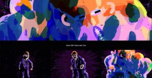
One of the boldest luxury brands to embrace brutalist aesthetics — from stark typefaces and glitchy layouts to intentionally “ugly” product shots, Balenciaga’s entire visual world rejects traditional beauty. Balenciaga appeals to a culture of irony, satire, and subversion.


 .
. 
-
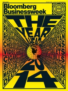
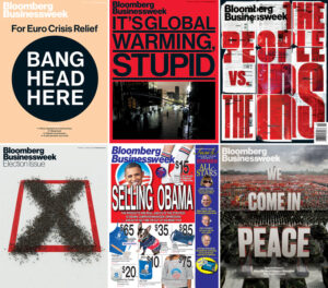
Bloomberg Businessweek (2010s Redesign)
Under creative director Richard Turley, the magazine embraced a raw, high-impact look — dense type, loud colors, and jarring compositions. The design energy mirrored the editorial voice — fast, direct, and unafraid of contradiction. It made business journalism feel urgent and modern.
 .
. 
-
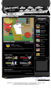
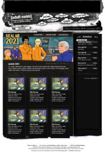
Adult Swim
Known for its weird, glitchy, minimal title cards and surreal animations, Adult Swim’s branding leans into brutalism without apology. Black screens, white mono type, zero hierarchy. It aligns with their absurdist, anti-mainstream content. The branding doesn’t try to sell — it exists, and that’s enough.
 .
. 

-
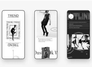
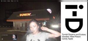
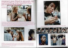
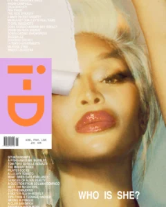
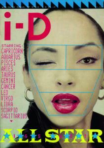
i-D Magazine
Certain versions of their digital layouts feature intentional crowding, stark fonts, and anti-design moments that break expectations. Some selected editions of their magazine covers also speak for the brutalist approach. i-D’s brand is about style and youth culture — this aesthetic aligns with a generation raised on fast, chaotic, layered digital visuals.

Finding the brutalist sweet spot
Brutalist branding walks a fine line between bold and broken. Here’s how to get it right:
-
Intent over imitation
Don’t use brutalism because it’s trendy. Use it because it reflects your brand’s voice or challenges your category norms. The style should serve the story.
-
Controlled chaos
Break the grid, but not the experience. The best brutalist design still respects contrast, legibility, and user flow — even if it looks like it doesn’t.
-
Context is everything
Not every brand can pull it off. A healthcare startup? Maybe not. But a fashion label, music brand, or creative collective? Brutalism might be exactly the signal of confidence and edge they need.
-
Blend soft with sharp
You don’t have to go full brutalist. A hybrid approach — soft typography with brutalist layout, or human texture within stark design — often strikes the most compelling balance.
The bottom line: Brutalism is a bold brand move
Done right, brutalist branding doesn’t alienate — it activates. It draws you in with its refusal to conform. It’s not about ugliness. It’s about honesty, friction, and unfiltered expression.
In an era where everything starts to look the same, brutalism gives your brand permission to be seen, not just scrolled past.
So yes, break the grid. Just make sure you know why you’re doing it.
Does your brand need to make a bold statement? Let’s have a chat!

Divya Chandrasekara Reddy
Divya is an architect-turned-designer passionate about exploring diverse creative mediums, with a strong focus on graphic design, user experience, and branding. With over three years of experience in design and branding, she constantly seeks innovative ways to craft compelling brand identities and immersive experiences. Beyond work, she enjoys indulging in photography and architecture, always finding inspiration in the details of the world around her.